
Three map checks I use to tell when a shrine or chapel is marking an old trade decision point.
The bend shrine: where the road makes you choose
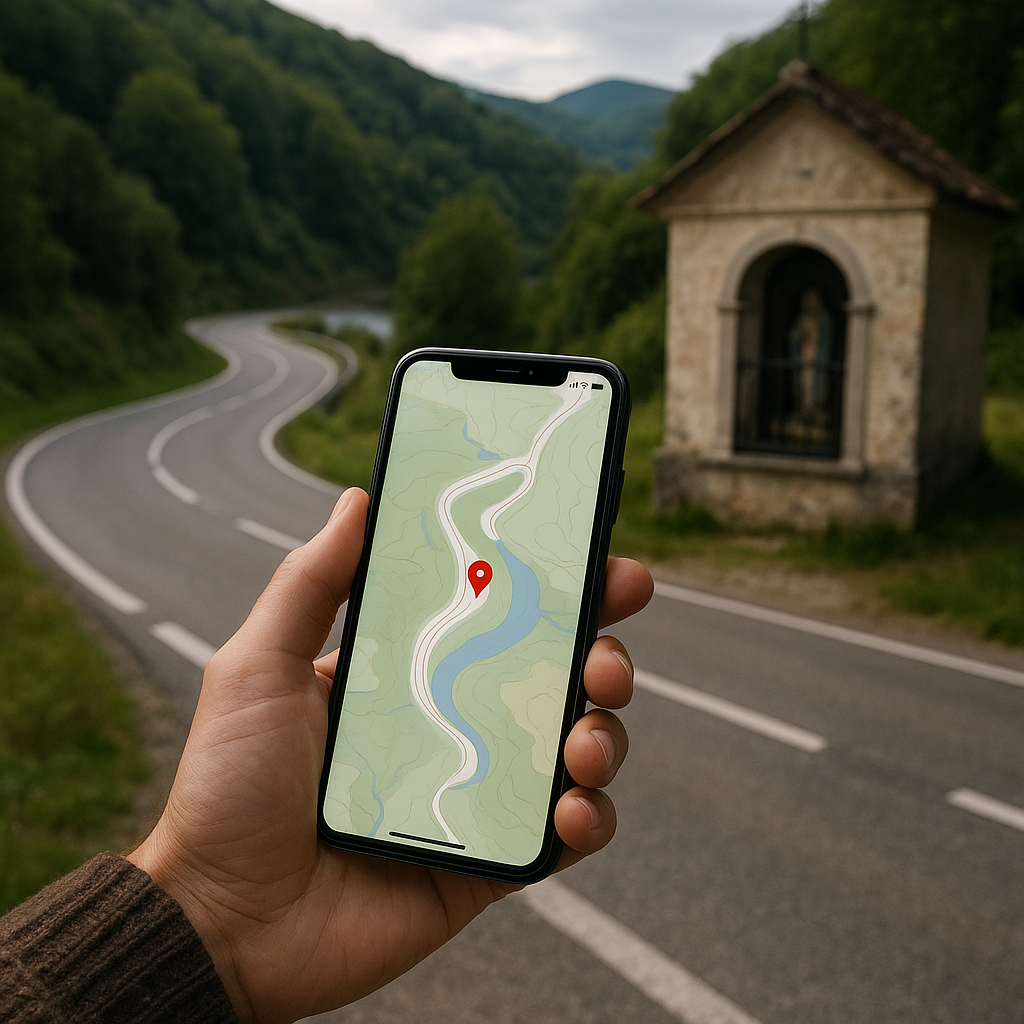
I used to treat roadside chapels and little saint statues as pure scenery. Then I started dropping a pin every time I saw one sitting at a hard curve, and the pattern got annoying in the best way. On a modern basemap, that bend looks like a simple engineering decision. On the ground, it feels like a place where you have to commit: one direction drops you toward water, another climbs, and your feet tell you there was never a straight option.
Here are the checks I run when I want to know if I'm looking at a devotional landmark or a leftover piece of route logic from the trading era.
- Zoom out until the bend is small. If the landmark sits where two valleys “argue” over the line of travel, you often see an older road thread: a faint parallel lane, a holloway, or a secondary track that still shows up as a dashed line on OpenStreetMap. The point isn't the chapel itself. It's that the bend is the hinge where traffic sorted into two directions.
- Flip to terrain shading. I like a hillshade layer because it makes the choice physical. If one option saves a steep grade but adds distance, that's a trade route conversation you can still feel in your calves. A lot of these chapels are where people paused to decide which cost they were paying today.
- Look for “service” footprints. A chapel at a decision point tends to have companions: a spring marked on a topo layer, a widened shoulder that reads like an old turnout, maybe even a cluster of older buildings that doesn't match the modern street pattern. On satellite view, I watch for a stubborn wedge-shaped plot or a tiny paved apron that isn't explained by the current road geometry.
Once you notice it, you start spotting bend shrines like punctuation. Not because someone wanted a pretty spot for a statue, but because that's where movement had to slow down, reorganize, and pick a direction. The border lines you cross later, the roads that get improved, even the town that ends up with the bus station, all follow from that original sorting.
Markets that don't sit in the center (and why that's the tell)
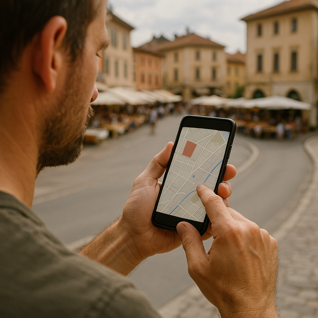
If you pull up a town on your phone and the market square is neatly centered, that can be planned civic pride. When it's shoved to one edge, I perk up. I've walked into enough “why is the plaza way over here?” situations to stop calling it quirky and start calling it a clue. Off-center markets tend to sit where traffic used to pass through, not where people merely lived. The town grew around it later, like foam hardening around a stick.
On a map, I test this with a very unromantic habit: I draw imaginary desire lines and see what still makes sense.
- Trace the straightest old connection. Find the obvious external anchors: the river crossing, the gap in the hills, the coastal landing, the low pass. Then look for the line that would connect them if you were moving carts and pack animals before modern grading. If that line runs right past the market-but-not-the-center, you may be staring at the old spine.
- Check for a “pinch” in the street widths. In satellite view, old market streets often widen abruptly into a fan shape, then narrow again. It's subtle. You see it in rooflines and the way awnings line up. I look for one street that stays oddly wide for 1 to 2 blocks, even when the rest of town has a different scale.
- Follow the names, but don't worship them. Sure, you might get lucky with something like “Mercado,” “Bazar,” or “Salt Road.” More often, the naming is bland. What matters is whether the road category changes at the market. On OpenStreetMap you can sometimes see a shift from residential streets to something tagged more like a connector right at the square.
What I like about this one is that it explains modern navigation annoyances. The main road you drive today might bypass the old market because trucks can't tolerate the squeeze. So the town ends up with a newer ring road, a new “center,” and a historic square that still acts like a magnet on foot. Tourists think it's picturesque. Locals treat it as the place you go when you need specific stuff, because the commercial pattern has had a few centuries to settle.
Once you start reading off-center markets this way, you stop getting surprised by where bus stops land, why certain corners are always busy, and why the “wrong side” of town has the best bakery. The old through-route keeps collecting the same kinds of stops, even after the original trade traffic is long gone.
Milestones, wayside crosses, and the numbers that still run the show
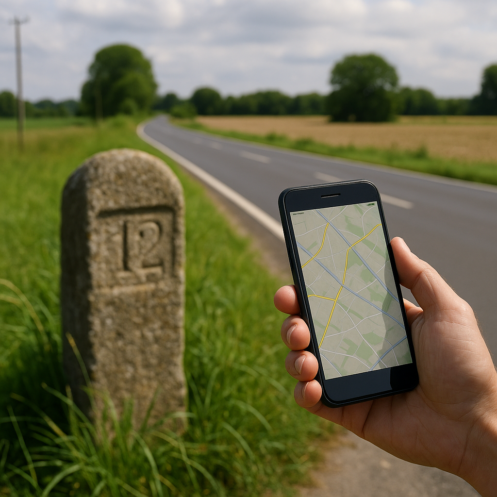
I love a dramatic landmark as much as anyone, but the most useful cultural markers on historical routes are often tiny and a little boring: a worn milestone half-swallowed by grass, a wayside cross at the edge of a field, a stone post with a coat of arms you can't quite read at speed. They don't look like they should matter. Then you notice where they sit: at municipal edges, at road forks that feel overbuilt, at the exact spot your GPS voice suddenly starts naming a different place.
When I find one, I don't just photograph it. I use it to interrogate the modern map.
- First, I check what the marker is measuring from. A milestone isn't interesting because it says “12.” It's interesting because it implies an authority and a reference point. If it points to a port, a cathedral city, or an old administrative center, that tells you which direction the money and paperwork flowed. That flow often predicts today's highway priorities and even which side of a border got the bigger road upgrade.
- Then I compare it to boundary lines. On many mapping apps you can toggle administrative boundaries. If a cross or marker sits right where two jurisdictions meet, that's not random piety. It's a seam. Seams attract markers because they're where responsibility changes: maintenance, tolls, policing, and who gets blamed when the bridge washes out.
- I look for the “stutter” in route numbering. This is a ground-truth thing. You're driving a clean, modern road, and suddenly the number changes, or the road name flips, or signage starts pointing to a different hub. If an old marker is nearby, it often explains why. The modern network is papered over the older one, and the old measurement system still shapes the handoffs.
My favorite moment with this was in a farmy stretch that felt like nothing. A battered stone post sat beside a roundabout that seemed absurdly engineered for the amount of traffic. On the map, the roundabout was just a circle. In person, it was the place three old lines converged: one to a river ford, one to a market town, one to a ridge route that stays passable when the lowlands flood. The post wasn't decoration. It was the receipt.
Those little receipts add up. Stack a few on a day of travel and you start predicting what your navigation will do before it does it: where the road will kink, where a town will sprawl, where the border will feel strangely “natural” because it followed a counting system that preceded the asphalt.