The Weird Reason North Won the Map War and South Got Stuck at the Bottom
You’ve probably seen it a thousand times: a map on the wall, north at the top, south down below. It feels so natural that we barely think about it. But the truth is that this wasn’t inevitable. For centuries, maps flipped and tilted in all sorts of ways, and the reason “north‐up, south‐down” became the default has less to do with geography than with power, worldview, and the map-makers themselves.
The Global North includes the world’s most industrialized, wealthier nations, such as the United States, Canada, most of Europe, Japan, South Korea, and Australia. Similarly, the Global South generally includes developing or emerging countries that were historically colonized or economically disadvantaged, such as Latin America, Africa, and parts of Asia, including nations like Brazil, India, Nigeria, and Indonesia. However, these labels aren’t about exact geography. Australia, for example, is technically “south” but counted as part of the North. It’s more about who ended up on top in terms of global wealth and power.
Map Orientation Used to Be All Over the Place
Image via Canva/Gemini studio
Old maps weren’t always drawn like the ones we see today. In ancient Egypt maps often had the south at the top because the Nile flowed north and “up” meant going upstream. In medieval Europe mapmakers sometimes placed east at the top since it was seen as sacred and pointed toward Jerusalem or the Garden of Eden.
In the Arab world maps often showed south at the top too, putting Mecca in a position of prominence. The shift to north-up maps didn’t happen only because of new navigation tools. It reflected the worldview of the cultures that eventually set the global standard.
Europe Said, “North Goes Up.”
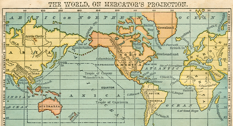
Image via iStockphoto/THEPALMER
By the 16th century, Europe was exploring, colonizing, and building empires. At the same time, map projection methods (like the Mercator projection of 1569) became standard for navigation. According to scholars, the north‐up convention grew out of European cartography tied to imperial and navigational needs.
Aligning with the north star or the magnetic north (or at least a convention that made “up” consistent) helped in seafaring and in spreading a single worldview. Once global maps started being mass‐produced and distributed by European powers, the north‐up format began to dominate.
By putting north at the top, maps subtly communicated: “this side is higher, more important, more central.” Research shows the orientation shapes perception: north tends to be associated with higher status or richer places, south with lower status or less developed places. The map war wasn’t just about where continents lay but also which peoples and regions got to appear on top.
Why The South Got Stuck at the Bottom
Once north at the top became the norm, every other layout began to look strange or even wrong. Turning a map so that the south was on top did more than confuse people. It questioned the worldview that had been accepted for centuries. South-up maps later became a way to challenge that order and to show that mapmaking reflects culture and power, not just direction.
North did not take the top spot because of any natural rule. It happened through a mix of convenience and influence. Navigation used the North Star and the compass, and European mapmakers set the global standard. What began as a practical choice slowly turned into a symbol of dominance.
When you look at a world map and assume north is “up,” remember that it was a decision made by people. A map shows more than geography. It carries a history of empire, exploration, and control. The “bottom” of the map is not truly below anything. It is simply where another point of view was placed.