
Bring an old topo and a modern route reference on your next ride, and the window turns into a before-and-after museum.
The moment a vanished station lines up with your window
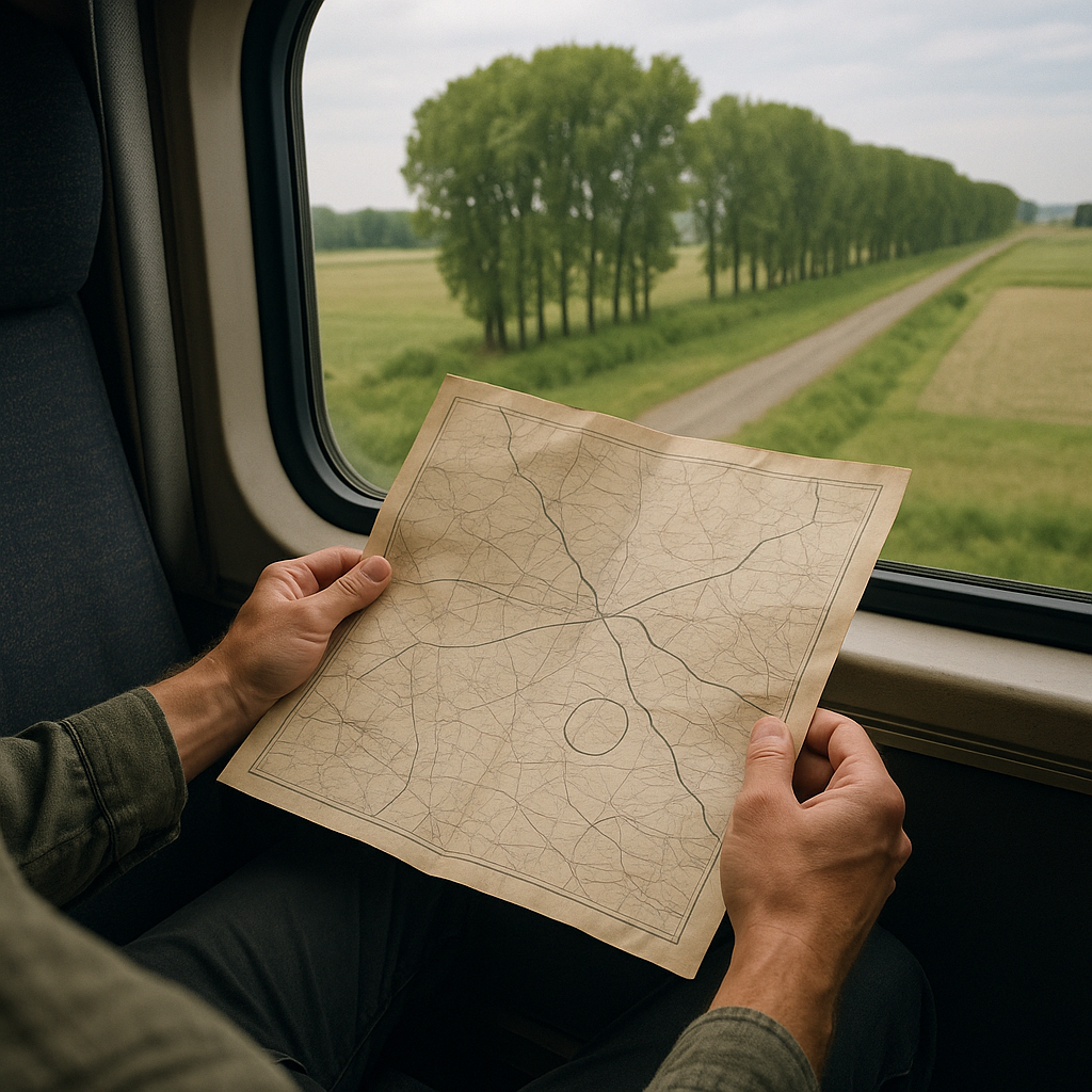
I keep a couple of railroad-era sheets saved for routes I ride more than once, because the surprise isn't the mountains. It's the human stuff that used to sit right where you're staring. A 1910 to 1930 railroad map or a USGS topo from that era may show siding names, small stops, and other railroad features that never appear on a modern passenger map. The trick is to pick one anchor you can be confident about (a river crossing, a junction where two lines split, a big curve around a hill), then watch the mile-by-mile scenery until the old name should be roughly there.
On one ride through a wide valley, I had an older sheet that marked a stop with a name I'd never heard in the onboard announcements. No station building in sight, no platform, nothing. Then the train slowed for a signal, and I caught it: a dead-straight line of cottonwoods and a weirdly level strip of gravel running off into a field, like someone had ironed the ground. That was the former spur. Once you see it, you can't unsee it, and suddenly the landscape feels edited, not just pretty.
If you want to do this without turning your trip into a frantic screen-tap, pre-mark two or three of those vanished points on the old map with a simple circle and a note about what to look for: bridge, cut, fill, siding, depot site. Then keep the paper folded to that area in your seat pocket. You'll miss a few. Everyone does. But when one lines up, it's a little electric, like the window just got a second layer.
Reading the land scars: cuts, fills, and the straight lines that shouldn't exist
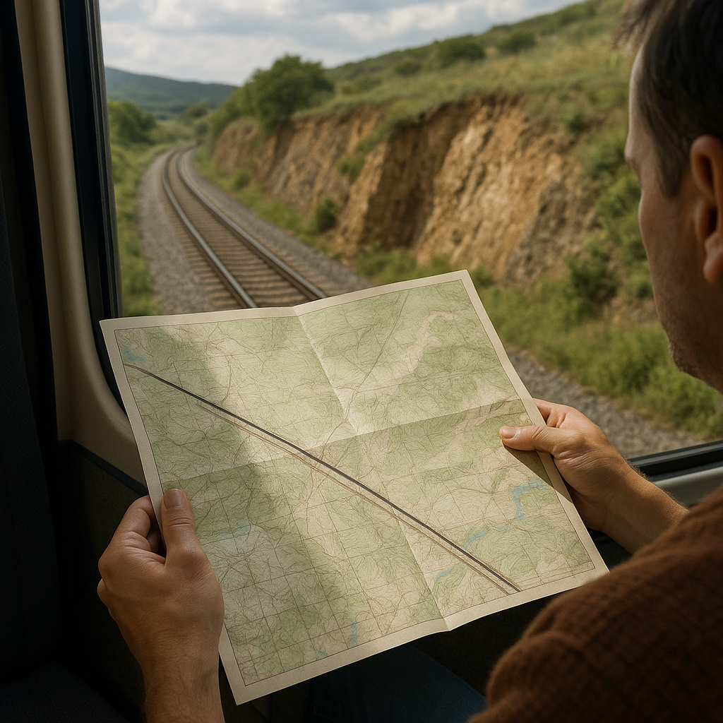
Modern mapping makes rail lines look clean and inevitable, like someone drew them with a single confident stroke. Older topographic sheets show the opposite: they make it easier to see how engineers worked around slopes, waterways, and elevation changes. If you want that "how did they even build this" feeling without needing a guidebook, look for the engineering fingerprints that old contours and symbols make easier to spot.
Here's what I watch for when I'm comparing an older topo to what rolls past the glass. A cut is the obvious one: a trench through a ridge where the rock face looks sliced, sometimes still sharp-edged, sometimes softened by a century of weathering. A fill can be subtler: an embankment built to carry the track across lower ground, sometimes visible where the land drops away on either side. On older sheets, contour lines can help show where the railroad crosses slopes, valleys, and other changes in terrain, offering clues about where cuts or fills may have been needed. When you catch one from the window, the engineering suddenly becomes much easier to read: the railroad is crossing terrain that would otherwise force a road or trail to bend around it.
My favorite tells are the straight lines that don't belong in nature. A long, ruler-straight ditch beside the track may be part of railroad drainage, although the landscape alone may not reveal when or why it was built. On older maps, you may find drainage features, streams, or named arroyos that are harder to recognize in the landscape today. Low-angle light can sometimes make shallow cuts and embankments easier to notice because their relief casts more visible shadows.
This isn't about being a rail engineer. It's about noticing that the postcard view is also a set of decisions. Once you start seeing cuts and fills, every scenic route has extra scenes packed inside it, and they repeat like motifs when you ride similar terrain elsewhere.
Track Charts, Map Scale, and What Your Phone Leaves Out
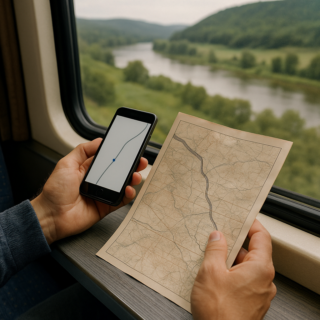
When people say they follow the train on their phone, what they usually mean is they watch a dot slide along a line. That's fine for bragging rights, but it's a lousy way to understand why a scenic route feels scenic. The problem isn't your GPS. It's scale and simplification. At one zoom level, the app generalizes curves. At another, it drops minor waterways and small ridge folds that do all the visual work outside your window.
If you want the old-versus-now comparison to land, pair two different map types on purpose. First: a historical sheet that shows the rail corridor in the era you're curious about (a railroad map, a topo, even a county atlas with the line drawn). Second: a publicly available corridor map, historical track chart, or other reference that helps you follow mileposts, junctions, stations, or the order of landmarks along the route. Railroads use track charts to record features along a route, and historical examples are sometimes available in archives, museums, government records, and railroad history collections. The point is simply to use the chart as another reference for understanding what passes the window.
Now do one very practical thing: use a historical map detailed enough to follow the landscape comfortably. For many U.S. routes, postwar 7.5-minute USGS quadrangles provide detailed contours, waterways, transportation features, and place names, making these comparisons especially useful. Then, on the train, stop trying to match the dot to the exact bend. Instead, match the sequence. River, cut, bridge, town edge, then a long straight through open ground. Once you think in sequences, the window stops feeling like random beauty and starts feeling like readable geography.
And yes, your phone is still useful. I just treat it as a clock and a compass, not the primary story. The primary story is in the old ink: what they thought mattered, what they bothered to name, and what has disappeared so completely that only a line on paper tells you it was ever there.