
Three island festivals hit harder when you compare old chart notes, parish maps, and colonial street grids to what you walk today.
Harbor charts that still tell you where the party happens
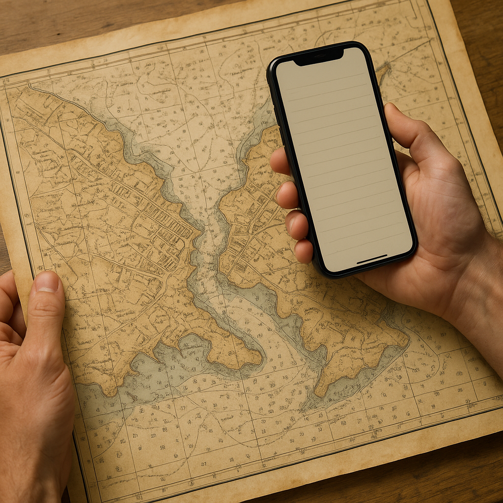
I started doing this after one too many island trips where the festival looked like a pretty add-on, then I got there and realized it was the whole operating system. The quickest way I know to see the logic is to pull an older harbor chart and read it like a gossip column. Not the modern, simplified basemap. I mean the sheets with dense soundings, hand-lettered notes, and warnings that feel personal.
Take Malta during the festa season. Historic charts of the Grand Harbour can help explain how waterfront settlements, quays, inlets, and ferry connections shaped movement around the Three Cities. They add useful context to celebrations that spill toward harborside streets and public spaces. Still, the chart alone cannot prove why a modern procession or fireworks display follows a particular route.
Practically, I save an older chart from a national archive, hydrographic office, or historical map collection, then annotate three layers on top of it in a notes app. First layer: old landing points and quays. Second: the modern bus stops and ferry slips I will actually use. Third: streets and open spaces that look worth checking against the current festival route, closures, and staging information. When I walk the area the day before the big night, those guesses give me useful landmarks to check against the actual festival setup. You notice the quiet streets that feel too narrow for the show, then you hit the broader stone approach that lines up with the old working harbor, and suddenly the banners and temporary lights make sense.
This is also how I avoid the lazy mistake of staying on the wrong side of the island. On paper, two neighborhoods can look close. A harbor chart makes the water barriers and limited crossing points easier to appreciate, which can help me plan where to stay and how to reach the celebration.
Parish boundary maps: the invisible lines under island rivalries
There are islands where the festival calendar is basically a neighborhood timetable, and the neighborhood isn't defined by what Google calls the district. It's defined by older lines: parish limits, chapel catchments, sometimes even the footprint of a long-gone wall. When I want to understand why two celebrations a mile apart feel like separate planets, I look for a parish map, not a tourist map.
On the Azores, for example, the Holy Spirit festivals vary from parish to parish, even on the same island. The first time I went, I kept thinking, why is everyone so specific about which street belongs to which group? Then I found older administrative and ecclesiastical maps that showed boundaries I never would have guessed from the modern street grid. Once you see those local divisions, it becomes easier to understand why Holy Spirit traditions can vary sharply between nearby communities and why particular churches, impérios, streets, and gathering places remain important.
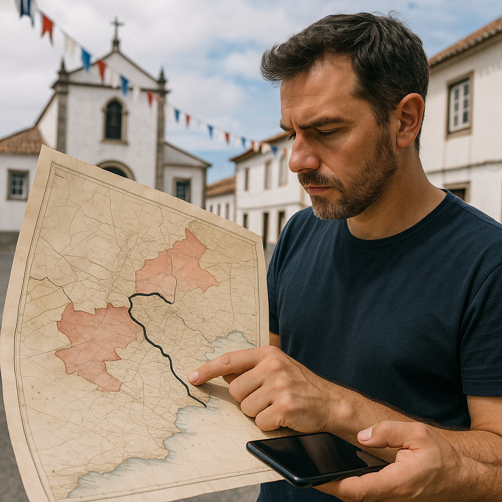
My method is low-tech but consistent. I pull a scanned historical map (the David Rumsey collection is a good starting point for many regions, and local archives often have PDFs if you hunt in the local language). Then I do two passes:
- Pass one: trace the boundary with a thick line so I can still see it on a phone while walking in the sun.
- Pass two: mark three anchor points that appear in both eras: a church, a cemetery, and a market or port gate. Those can be useful anchor points when they appear on both the historic map and the modern street plan.
When I'm on the island, I walk the boundary as if it were a route, even if it isn't a formal trail. You feel the shift where one area has a different color of bunting, or the fundraising posters change logo, or the marching band practice drifts from one set of streets to another. It sounds obvious written out, but it's not obvious when you're jet-lagged, and the island looks like one continuous cluster of houses.
And here's the part that surprised me the most: once you understand the boundary, you can pick where to stand without being in the way. You can use those historic boundaries as context for noticing where decorations, gathering points, and local traditions change from one community to the next. That moment is the deeper reason to visit, and the map gets you there on purpose.
Colonial street grids that predict where festivals bottleneck
Some islands have street layouts designed by someone with a ruler and a distant boss. You can feel it when you arrive: long straight corridors, right angles, a main square that looks perfect in an engraving. During a festival, that historic layout can help explain why certain streets feel more constrained than others, although current closures and crowd-control plans ultimately determine how people move.
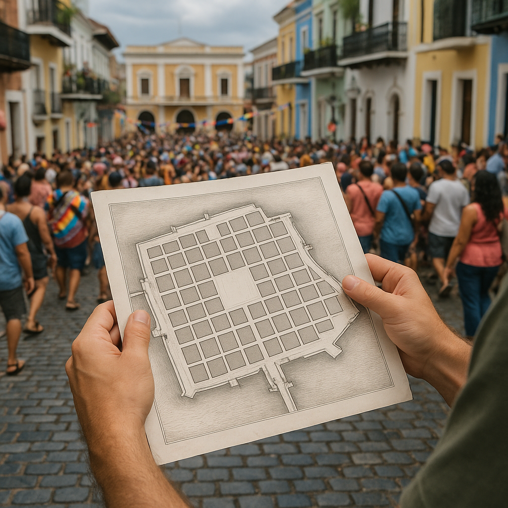
San Juan, Puerto Rico, is my favorite example because the old city is both walkable and unforgiving. During big events, Old San Juan's narrow streets, plazas, historic walls, and limited cross-streets can make crowd movement feel very different from that in the modern city outside the old district. If you pull an older plan of the walled city, the historic gates, walls, and main axes can help you understand the street network that modern crowds still move through. The Library of Congress holds detailed historical material on Old San Juan's fortifications and urban layout.
What I do with these plans is more like a pre-walk audit than a romantic history exercise. I print a single page if I'm carrying a daypack, or I keep it as an offline image if I'm going light. Then I mark:
- Two cross streets that cut the main route and have room to step aside (you want a doorway line, a small plaza, or a wide curb).
- One hard barrier where you can't slip away, like a wall segment, a steep drop, or a dead-end facing the water.
- One elevated public viewpoint, if it is open and permitted during the event. Historic bastions and terraces can provide useful orientation, but I check current access before relying on them.
The benefit isn't just comfort. It's timing. If you're trying to catch a specific moment, like a saint's image returning to a church or the instant a street band hits the main square, the grid can trick you into thinking you can cut across quickly. You can't, not when the route is full, and the corners are tight. The historic plan can help you distinguish the main historic corridors from smaller secondary streets.
On my last trip using this approach, the difference was simple: I watched the main procession once from inside the flow, then stepped out before the squeeze, took a side street I knew would stay open, and still made it to the plaza ahead of it. No heroics, no sprinting, no climbing anything. Just an old plan doing what it was made to do.